
Widget gallery
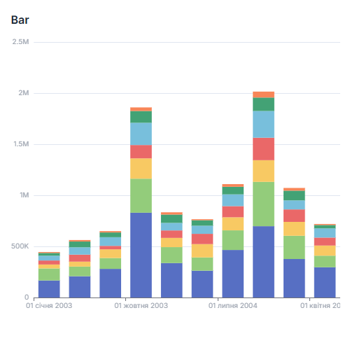
Bar Chart
Bar Chart is a versatile tool for comparing values across categories, ideal for evaluating and visualizing differences between various groups or data sets.
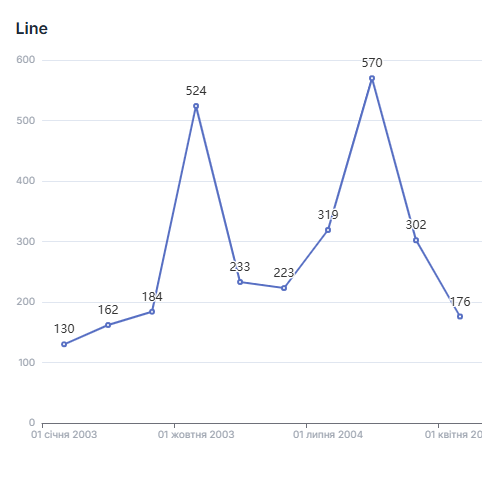
Line Chart
Line Chart is perfect for displaying changes and trends in data when it's important to see how metrics evolve over time.
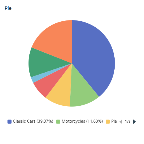
Pie
Pie Chart is ideal for showing proportions in a whole context or comparing proportions between categories.
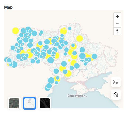
Point Map
Point Map is ideal for geographic analysis and visualization of spatial data.
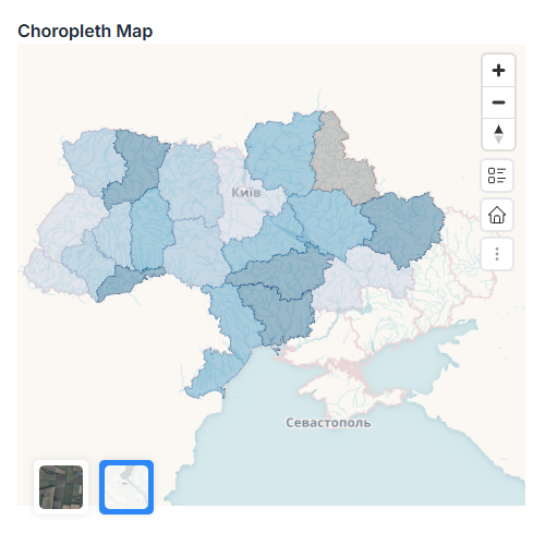
Map (Choropleth)
Choropleth Map is perfect for geographic analysis and visualizing spatial data across countries, regions, or city districts.
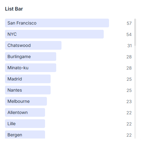
Bar List
Bar List chart is perfect for rankings, comparisons, and presenting data in an easy-to-understand format.
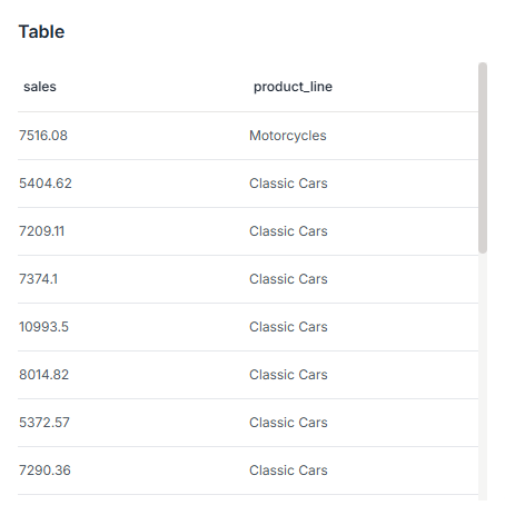
Table
Table is ideal when you need to display precise values or provide users with the ability to analyze data in more depth.
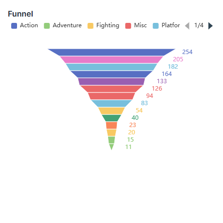
Funnel
Funnel chart is perfect for analyzing conversions and process efficiency in sales, marketing, recruitment, or any staged process with drop-offs.
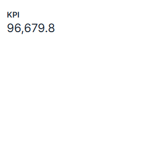
KPI
KPI chart is ideal for KPI metrics and quick assessment of key indicators.
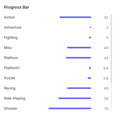
Progress Bar
Progress Bar chart is perfect for tracking progress toward specific goals.
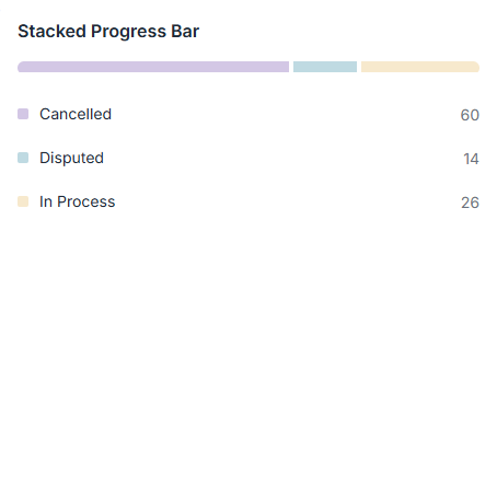
Stacked Progress Bar
Stacked Progress Bar chart is ideal for displaying progress in multi-phase processes where it's important to see how individual parts contribute to the overall result.